Yommy Sandos

(This was a conceptual case study during my enrollment in the Google UX Design course. Although Yommy Sandos is a fictitious shop, the research and design were based off of actual research studies.)
Yommy Sandos is a local sandwich shop located in a suburban area. The shop specializes in Japanese milk bread sandwiches, Japanese dessert, and drinks. Their target customers are college students and busy workers who need a quick meal and customizable options.
Project Duration:
My Role:
UX designer and researcher
January 2022 to May 2022
Mapping user flows, competitive audit, conducting interviews, paper and digital wireframing, low and high-fidelity prototyping, conducting usability studies, designing for accessibility, and design iteration.
The Problem:
The Goal:
Busy students did not have time to cook their own meal.
Design an app for Yommy Sandos that allows users to easily customize and order Japanese sandwiches, desserts, and drinks.


The Research:
I conducted six surveys with several users to better understand their needs and frustrations:
A primary user group that was discovered were graduate students who did not have time to prepare their own meals. This confirmed my initial assumption about these users, but I also discovered that many of them had part-time jobs on the weekends and hobbies that further hindered their time to prepare their own meals.
Pain Points:
1
Time
Full-time students are often too busy to prepare their own meals
2
Allergens
Food apps do not include detailed ingredients
3
Price
No clear price on the menu while ordering
4
Customization
Difficult to customize orders or modify them through the apps
Meet Kevin:

+ click image to enlarge
User Journey Map:

+ click image to enlarge
As a visual learner, this map allowed me to see all the opportunities a specialized food customization app could be helpful for the sandwich shop while tending to user frustrations.
Competitive Audit:

I compared the strengths and weaknesses of each competitor to determine the opportunities of improvement and become more confident with my designs.
Wireframing:

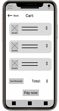
Star symbols were used to label elements to include in the initial wireframe.
This section allows users to easily customize the order according to their needs

The food allergy labels provides a quick way to inform users who may be allergic
The notes section gives the user the freedom to add any additional requests
Keeping the user pain points in mind during my initial design phase, I added a few accommodating options to ensure the user has the freedom and flexibility to modify their order accordingly.
The detailed filters can allow users to cater the search criteria to meet their needs

Clear depiction of the prices and images of each item allows for easier browsing
Being able to easily locate the prices and images along with each item was one of the major considerations in my design.



Usability Study Findings:
I conducted two moderated usability studies to explore common pain points and iterate on design solutions. Both were performed remotely via Discord call where participants shared their screens.
Round 1 Findings:
1
2/5 users want a simple item layout
2
2/5 users want a simplified menu
Round 2 Findings:
1
2/5 users want a more visually appealing homepage
2
3/5 users prefer clickable image options in the customization section
Design Decisions:
Before Usability Study 1:
After Usability Study 1:


My early design of the menu page showed many items, but after the usability studies I simplified the layout so that users would not feel overwhelmed by the clutter.
Before Usability Study 2:

After Usability Study 2:

My second usability study highlighted the confusion with the layout of the homepage. I simplified the layout to include recommendations and general options from the shop menu.
High-Fidelity Prototype:

The final high-fidelity prototype shows minimal and cleaner user flows for customizing a sandwich and completing the order. It also allows the user to see the top recommended items from the homepage.
Accessibility Considerations:
1
The voice-to-text feature in the top search bars allow users to have another method of searching for what they need.
2
The choices for the font and color palette were picked following WCAG 2.0 and are AAA compliant.
3
Used universally-recognized icons to help users navigate easier
Takeaway:
Impact:
This app allows users to fully customize their orders and considers their needs.
One quote from user feedback:
“This app honestly is pretty good!”
5/5 users thought it was easy to use in our usability studies.
What I learned:
-
While designing this app, I learned that giving users more options actually makes it a more overwhelming experience
-
I also learned iteration is an important tool to contributing to the visual and usable aspects of an app
-
After many iterations, my design now is much more minimal and concise compared to the initial designs
-
Valuable usability studies and peer feedback also helped shape the app into its final look.
Next Steps:
1
Future usability studies with the final look of the app to determine if pain points have been resolved and the design is intuitive to use.
2
Integrate more allergen tags into the app.
Thank you for your time! 😊
If you’d like to chat more about my work or get in touch, my contact information is below:
Email: ux.cindyla@gmail.com
LinkedIn: https://www.linkedin.com/in/cindy-la/