Pink Peach

(This was a conceptual case study for the Google UX Design course. Although Pink Peach is a fictitious company, the research and design were based on real participants.)
Project Duration:
Pink Peach is a sustainable trendy clothing store that offers timeless, quality pieces. The typical shopper is between 18-30 years old, and most shoppers are students or early career professionals.
May 2022 to June 2022
My Role:
I conducted user interviews, performed a competitive audit, created the site map, mapped user journey and flow, ideated paper and digital wireframing, designed low and high-fidelity prototyping, conducted usability studies, and iterated upon feedback.
The Problem:

Current online shopping websites don’t show reliable reviews that allow the user to pick the sizes that best fit them.
The Goal:
Design an online shopping website to be easy to navigate, with detailed review sections for each item, and a simple checkout process.


Tablet & Mobile Versions:


The Research:
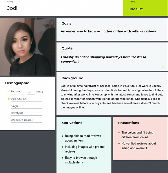
I conducted 6 user interviews that allowed me to create personas to better understand the target audience and their pain points:
I discovered that current shopping websites do not show reliable reviews that allow users to choose the correct sizing for their fit. This cause users to be frustrated that their product expectations were not met.
Pain Points:
Reviews
Some shopping websites do not offer reliable reviews for the product, which may deter the user from purchasing the product.
Sizes
Sizes offered online do not reflect the actual size, or they do not offer enough options for more users.
Meet Jodi:
User Journey:

I created a user journey map of Jodi’s experience using the website to better understand the flow and identify any areas of improvement.
Competitive Audit:

I compared the strengths and weaknesses of each brand to determine the opportunities of improvement.
Site Map:
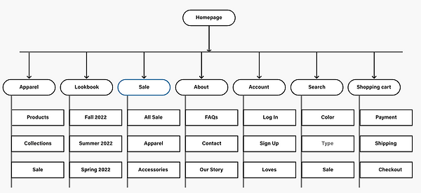
I made sure to create an information architecture that was simple and easy for users to find what they are looking for.
Wireframing:

Homepage website sketch

Homepage tablet sketch

Homepage mobile sketch


Usability Study Findings:
I conducted two usability studies to explore user pain points and iterate on design solutions. The first round was an unmoderated study remotely via Maze, while the second round was a moderated study remotely via Discord call.
Round 1 Findings:
1
Users expected the logo to take them back to homepage from the checkout page
2
Users felt the checkout button should be made more clear on the checkout page
3
Users wanted better organization of the clothing categories
Round 2 Findings:
1
Rename the Shirts category to be more specific
2
Make the color selection state more prominent
3
Add more details about the items to the order review box
Design Decisions:
Before Usability Study 1:
After Usability Study 1:

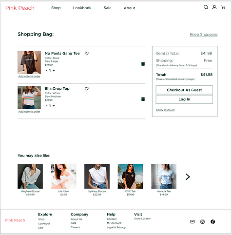
After insights from the usability study, I changed the button on the Shopping Bag screen to state “Checkout as guest” instead of “Continue as Guest” to eliminate uncertainty.
Before Usability Study 2:
After Usability Study 2:


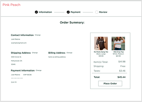
After feedback from the second usability study, I added more details to the order summary page and confirmation page so that users can review their items clearly.
High-Fidelity Prototype:

Accessibility Considerations:
1
Universally-recognized icons were used to help users navigate intuitively.
2
The choices for the font and color palette followed WCAG 2.0 and are AAA compliant.
Takeaway:
Impact:
This website allows users to browse clothing with:
-
Detailed user reviews that accompany images
-
A size fit meter based on user reviews
Our target users shared that this website was easy to navigate and useful for online shopping. Many users liked the layout and images used.
During the journey of this website design, I learned that:
-
Making features more intuitive will allow users to have an easier time navigating and finding what they expect from the site.
-
The feedback from users and peers really helped me see the designs from a different perspective and shaped each iteration.
Next Steps:
1
Future usability studies should be conducted to confirm the final design is intuitive and have eliminated any pain points.
2
Allow users to input their own measurements to create a virtual avatar so they can see how the item fits in their sizing.
Thank you for your time!
If you’d like to chat more about my work or get in touch, my contact information is below:
Email: ux.cindyla@gmail.com
LinkedIn: https://www.linkedin.com/in/cindy-la/